Line series part 2: Nicolai Fechin and the line between order and chaos
Line series part 2: Fechin and the line between order and chaos
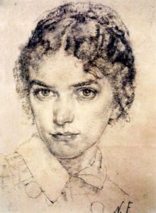
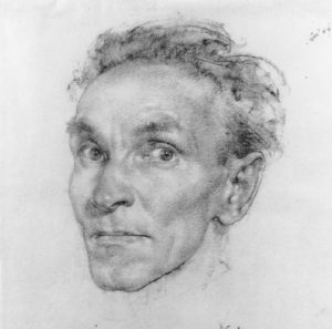
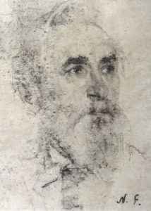
 In the previous blog in the line series, I discussed the work of Hans Holbein the Younger, one of the most influential draughtsmen in history. One of Holbein's biggest fans is someone you might not expect if you had only seen his paintings. I'm of course talking about early 20th Century Russian American artist, Nicolai Fechin.
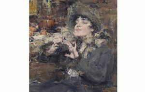
Looking at his paintings, which contain no obvious allusion to line, you might think he was more inspired by the works of someone like Antonio Mancini. Fechin is known for his highly textural, almost abstract paintings that play on the dichotomy between chaos and order, abstraction and realism.
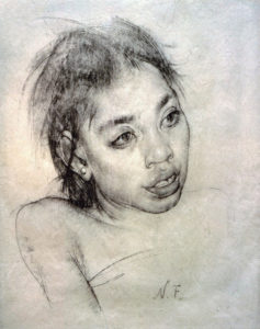
And unlike Holbein, Fechin’s drawings do this too. But, very much like Holbein, Fechin delicately balances his drawings on the subtle beauty of outline and accent. In his works we see a contrast between this idea of soft lighting, dramatic line work, minimal modelling and chaotic textures.
You can quite quickly see how Holbein's economic use of line and tone influenced Fechin. Indeed, Fechin actually copied several Holbein drawings.
The solidity of line
While Holbein kept his drawings clean and crisp, Fechin opted for a more varied textural approach. But the thread that holds both artists’ drawings together is that solidity of line. In Holbein’s the clean line gives form to the relative emptiness on the rest of the page. In Fechin’s the strength and certainty of line holds together the sense of chaos and disorder elsewhere in the drawing.
What sets Fechin apart from many portrait artists in history is that his sense of beauty does not conform to traditional idealisations. Instead, he sought to capture the asymmetry of the human face, the unusual and at times the grotesque. Some of his more bizarre characters might be likened to the ‘tronie’ paintings of the Dutch Golden Age.
Fechin’s drawings are unique. They are often mistaken for modern works for their boldness when in fact many contemporary artists frequently attempt and often fail to imitate him.


Line series part 1: Holbein’s line work and an early incidence of catfishing
Line series part 1: Holbein’s line work and an early incidence of catfishing
Line seems to be demonised in some circles of art training today. Many of the modern ‘atelier’ styled schools dismiss it in favour of mass and shape. “There are no lines in nature” is a common refrain. “Line is simply the boundary between two masses”. Modern schools often neglect line work and worship the optical copying of value for value, shape for shape.
But this idea of drawing simply the tones that form an impression in front of our eyes is a relatively new one. Prior to the 19th Century, line was a premier tool of most draughtsmen and the sole tool for many. Think Michelangelo, Raphael, Leonardo, Rubens, Van Dyck, right through to Ingres, Watts and Leighton. Line quality can be incredibly evocative, expressive and can describe form in an intensely powerful way. It can be rhythmic, almost poetic or musical. Variety of line weight can say at least as much about the solidity and three dimensionality of an object as gradations of tone can. It is the reason the great sculptors understood so vividly the relationship between line and form.
I’ll be writing a series of posts over the coming weeks about line in all its beautiful wriggling and writhing permutations, starting now with one of its greatest masters.
The master of line
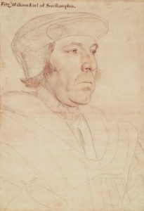
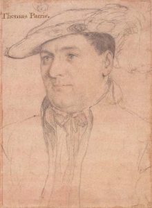
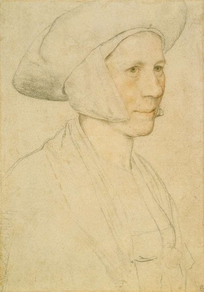
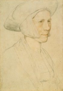
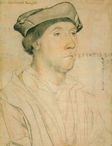 Hans Holbein the Younger’s drawings are some of the most sensitive, lifelike and three dimensional in the history of art and yet they are really very little more than careful line drawings with a touch of tone or coloured pigment. The tonal modelling is so subtle and yet the expression of form is so powerful.
Note the shifts in line weight, often more delicate as the form turns away from the viewer and more intense as forms come towards. Subtle overlaps tell the viewer what forms sit in front and which recede. The minimalism of his drawings keep them fresh and draw focus to the areas of most importance – the features and the contours – while the in-between stays relatively unsaid. The crispness of his line retains a certain freshness.
Holbein did not by any means restrict his drawing media, instead often opting for a mixed media approach, with various coloured chalks and watercolour as well as metalpoint and ink – at times all in one drawing. Many of his outlines are reinforced with brush and ink, giving them at times quite a contemporary feel, almost graphic.
16th Century Catfishing
Holbein is remembered as the court painter for Henry VIII, for whom he was regularly commissioned to make portraits of the King’s potential marriage prospects. One notable case was that of Anne of Cleves, whose marriage to Henry lasted just six months and was never consummated. Henry believed Holbein had exaggerated Anne’s beauty in his depiction of her and so the King was disappointed when he saw her, remarking that “she is nothing so fair as she hath been reported”. Essentially, the King became an early catfish victim.
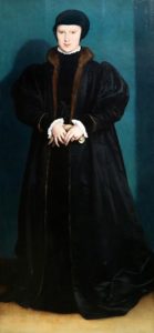
One stunning Holbein portrait, also commissioned by Henry as part of his 16th Century dating strategy, was of Christina of Denmark. While the marriage never happened for political and religious reasons, Henry was very much taken with the sketches and asked Holbein to create a full length oil which is today a part of the collection of the National Gallery.
You can see how Holbein’s line work and simple, minimal modelling translates to his paintings. The uncluttered, simply rounded forms retain their graphic power, allowing for a stronger design. The unified, compressed tones give the sitter a softer appearance, drawing focus to the features. This technique is used in a similar way today in many social media beautifying filters.
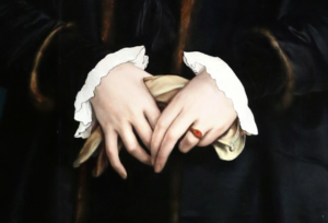
But to bring this rambling full circle, we must take a minute to marvel at the audacious use of line in Christina’s cuffs and ruff. The stark, almost comical outlines act as a bold foil to the softness of her face.
Please enjoy a few more examples of Holbein’s portrait drawings.